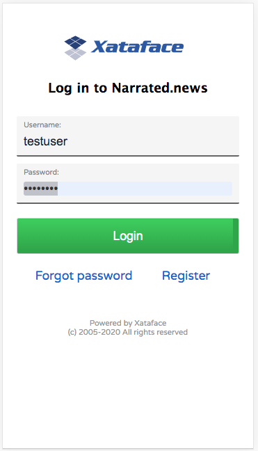
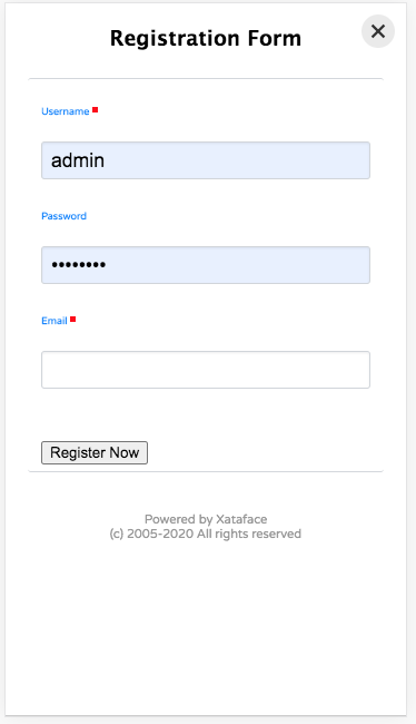
During my two week “vacation” from Codename One, I’ve been madly working on a new project using Xataface. For this project, I really needed the mobile interface to be smooth, so I decided to finally make Xataface’s core theme responsive. Along the way, I also made numerous improvements to the flow of the UI especially in relation to sorting and filtering results. Before I go into detail about the new features, here are some screenshots of my app, which uses this new mobile theme.

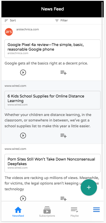
Let me unpack that above screenshot of the list view to highlight the various aspects you can see here.
- The “tables” menu is rendered along the bottom of the screen as tabs.

- Sorting and filtering buttons are rendered at the top of the list.
 When you scroll down the page, these buttons are converted into floating buttons:
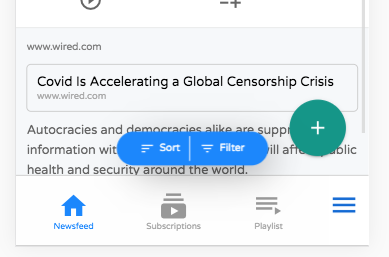
- Notice the Floating Action Button in the lower right for adding new records.
 . By default this shows the “New” and “Delete” actions, but you can add your own actions to this menu using the “table_actions_menu” category.
 - Notice that action icons below each row. These are rendered from the “list_row_actions” category.

Sorting
Clicking on the “Sort” button displays a sheet with the various options available for sorting.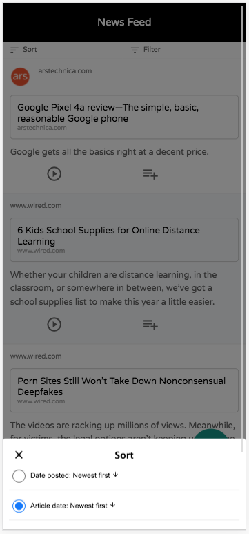 . You can select which columns should be sortable in the fields.ini file using the new
 sortable directive.
Filtering
Clicking on the “Filter” button displays a sheet with the various options available for filtering.

This filter dialog is “live”. The button at the bottom that says “Show 977 Results” will dynamically update as you enter your query so that you can see how many results there will be.
Optional Search Header
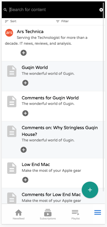
On some tables you may want the header to be a “search” field. This can be achieved using the the new fieilds.inii “search_field_header” directive, as demonstrated in this table:
New/Edit Record Forms
Forms are Xataface’s bread and butter, so they need to be very mobile friendly. I’ve completely revamped the stylesheet to be responsive so that forms are a pleasure to use on the smaller displays.
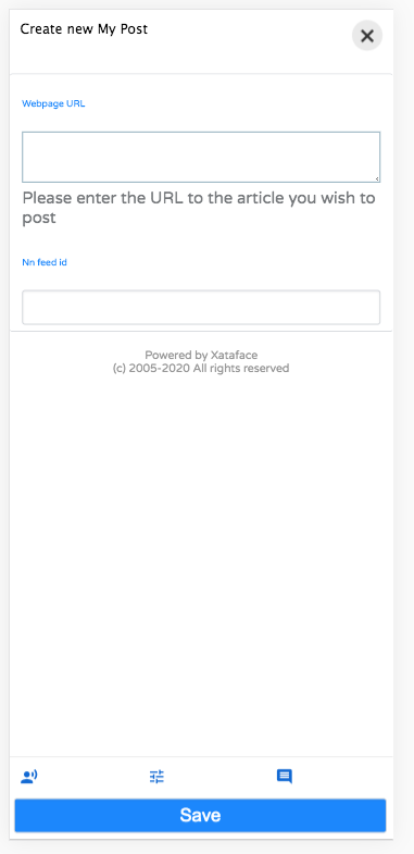
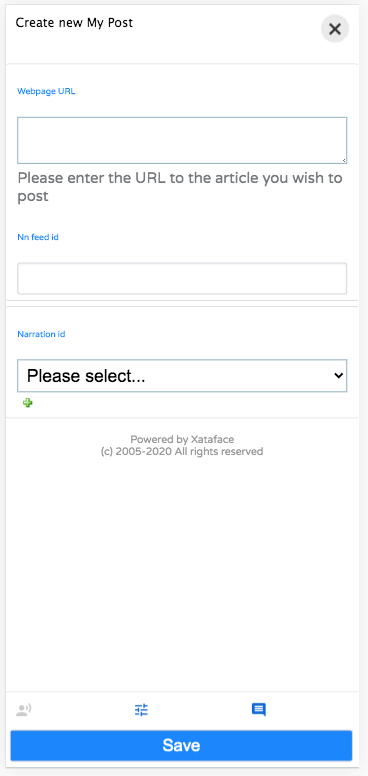
I’ve also added a new feature to help reduce clutter on forms. You can now make field groups “hidden” by default. Hidden field groups are collapsed into buttons that are rendered at the bottom of the form:

The user can display a hidden field group by clicking on the corresponding icon. E.g. In the example form shown above, the user might want to edit the “narration”. They can do so by clicking on the “Narration” icon at the bottom of the form, which will reveal the narration-related fields.
More to Come
This is just a quick post to share some of the work. There are tons of new features that I didn’t cover here. I’ll be blogging more about them soon.
I’ve been slowly assembling a “definitive” guide for Xataface. You can see the current version (in progress) at https://shannah.github.io/xataface-manual/
After I’ve ported all of the existing documentation into this manual, I’ll be using it as the basis for a new website. There is lots of new stuff in the pipe for Xataface, so stay tuned.